Findings
| Before | After | |
|---|---|---|
| Verdict | Review recommended | Looks good |
| Findings | 2 (0 high, 1 medium, 1 low) | 2 (0 high, 0 medium, 2 low) |
| Check id | 3d9b53b9-1a8f-4f83-87aa-80ecfca39516 | 494fb464-61e0-4066-a00d-f39f0e992398 |
| Provider | approved-vision | approved-vision |
Before
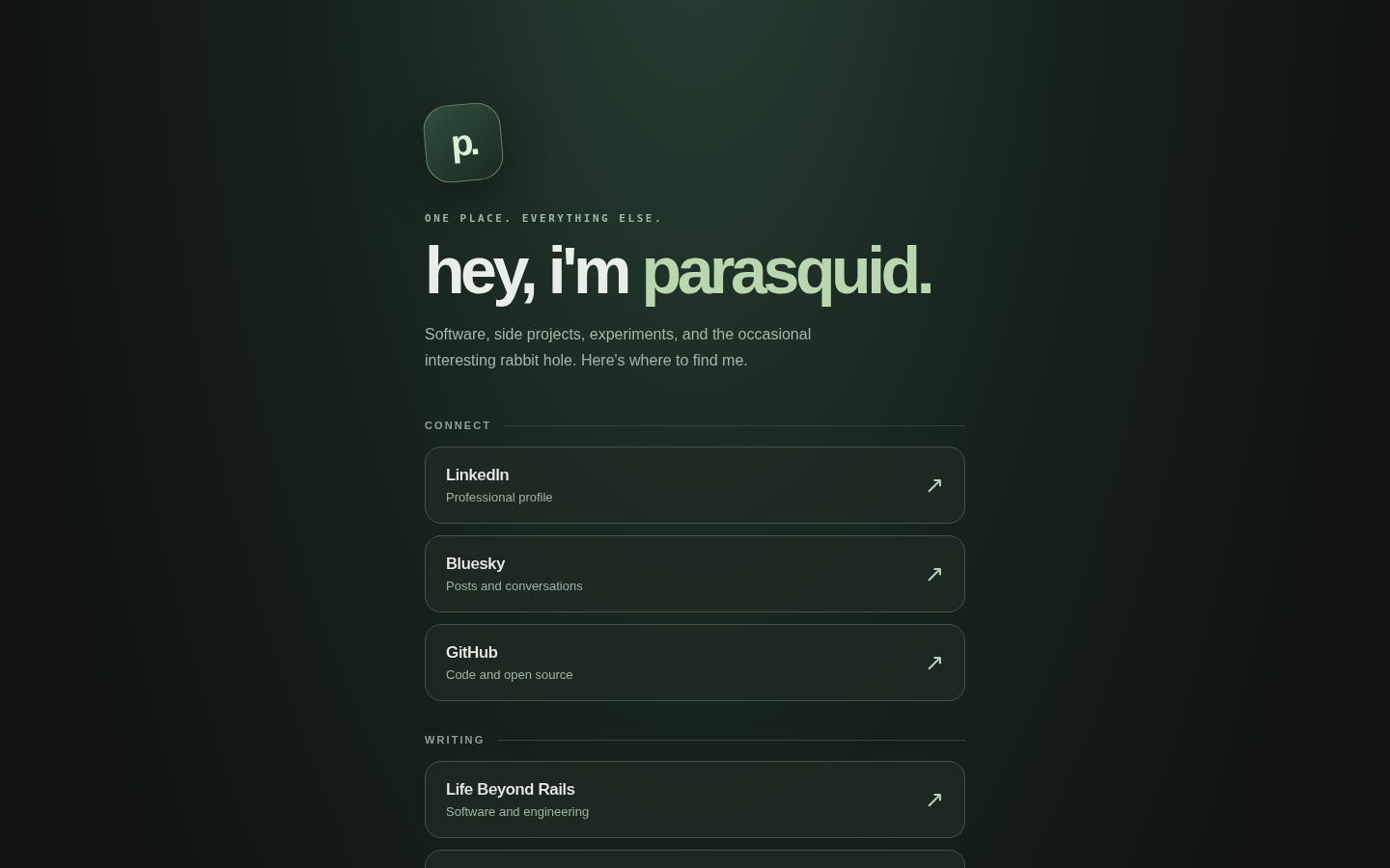
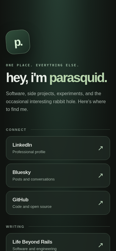
- medium: Text renders too small to read comfortably
- low: Body copy line length is too long
After
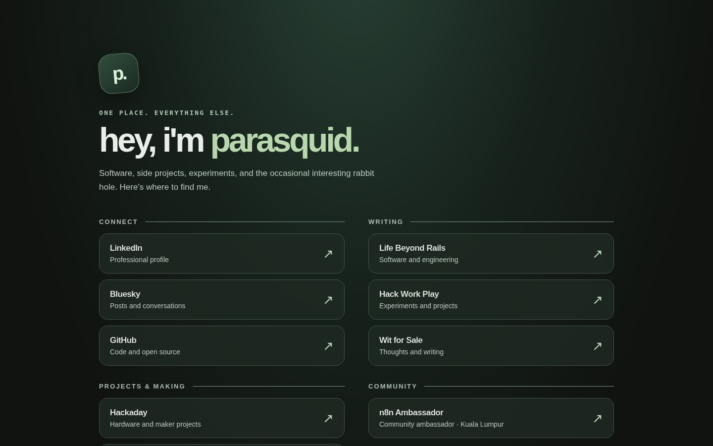
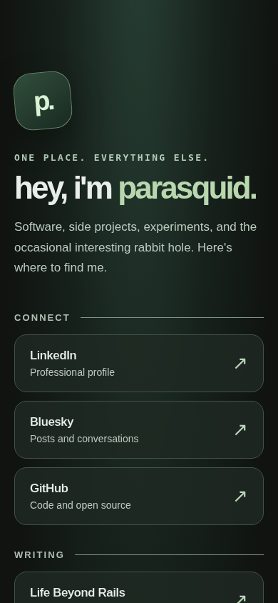
- low: Desktop content alignment feels left-heavy with excessive right margin
- low: Text contrast is too low against its background
Counts are the real results from the checks. The check is automated and can report new, smaller issues on a changed page, so the count alone does not tell the whole story.
Desktop (1440 wide)
Mobile (390 wide)
What changed
- Smallest text raised from 11-12px to 13-14px.
- Body copy width capped at 560px so lines are shorter.
- A skip link to the main content and a named main landmark.
- Layout, colours and all original copy kept.